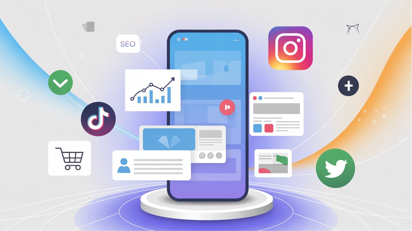
Mobile design is now a central part of digital marketing because users spend more time on smartphones than any other device. Reports show that over 60% of online traffic comes from mobile, which means businesses can no longer afford to treat mobile optimization as a secondary task. At CWL technology, our experts approach highlights that focusing on mobile design is not limited to visuals but also includes accessibility, speed, and convenience. When a business creates strategies around the mobile experience, it ensures that users receive smooth interactions, faster access to information & a reliable experience regardless of where they connect. Also this focus improves satisfaction, increases engagement, and supports stronger digital marketing performance and a well-structured mobile design helps brands stay competitive, retain users, and create long-term value in the market.
The Growth of Mobile Usage
The number of smartphone users continues to rise each year and people now use their phones for browsing, shopping, banking, and even professional networking. Google has already adopted mobile-first indexing, which means that the mobile version of your site is considered the primary version for ranking. A slow or poorly optimized mobile site can result in lost customers and lower search engine rankings. Research shows that more than 50% of users leave a site if it takes longer than 3 seconds to load.
Why Mobile Design Matters in Digital Marketing
A digital marketing campaign can only be successful if the user experience is smooth. Mobile design is directly linked to user satisfaction, conversion rates, and brand trust. A site that works perfectly on desktop but performs poorly on smartphones risks losing a majority of its audience. Elements such as responsive design, optimized navigation, and mobile-friendly visuals improve overall engagement, businesses that adapt their digital marketing to focus on mobile see stronger retention rates and higher return on investment.
Mobile-First Design vs. Responsive Design
While responsive design ensures that a website adjusts to different screen sizes, mobile-first design prioritizes the mobile experience during the initial stages of development. Mobile-first design focuses on speed, touch-friendly elements, and clear content layout for smaller screens. In contrast, responsive design adapts existing layouts for different devices, both approaches are important, but in digital marketing, mobile-first often provides a stronger advantage since most users engage on phones first.
|
Feature |
Mobile-First Design |
Responsive Design |
|
Development Approach |
Designed first for mobile screens, then scaled up for larger devices |
Designed for desktop first, then adjusted for smaller devices |
|
Focus |
Speed, touch-friendly elements, simplified navigation |
Flexible layouts, resizing and rearranging elements |
|
User Experience |
Prioritizes mobile users, often faster & cleaner |
Works well across devices but may feel less optimized on mobile |
|
SEO Impact |
Stronger mobile performance aligns with Google’s mobile-first indexing |
Still effective, but may require extra optimization for mobile |
SEO Benefits of Mobile-Friendly Design
Google has made it clear that mobile experience is part of its ranking algorithm. A mobile-friendly site improves visibility in search results, features like compressed images, faster loading pages, and easy-to-read fonts not only enhance user experience but also align with SEO best practices. Marketers who integrate mobile design into their SEO strategy are more likely to achieve higher rankings, better click-through rates, and improved organic traffic.
Mobile Design & Social Media Engagement
Social media platforms are primarily accessed through smartphones. More than 80% of Facebook, Instagram, and TikTok users rely on mobile apps for interaction. This means that any content shared on social media must be designed with mobile viewing in mind. Images, videos, and ad formats should be optimized for small screens to increase engagement and a digital marketing strategy that aligns mobile design with social media efforts creates consistent experiences for users across channels.
Mobile-Friendly Advertising
Pay-per-click (PPC) campaigns, display ads, and social media promotions should all be designed with mobile users in mind. Mobile ads require shorter text, engaging visuals, and fast-loading landing pages. A campaign that ignores mobile compatibility risks wasting ad spend because users will leave if they cannot easily navigate the page. Well-designed mobile ads capture attention quickly and drive higher conversion rates.
E-Commerce & Mobile Design
Online shopping has shifted heavily to mobile devices. A survey shows that more than 70% of e-commerce sales now come from smartphones. Mobile design elements such as simplified checkouts, secure payment gateways & user-friendly navigation helps in customer satisfaction. Cart abandonment often occurs when the checkout process is too complex or slow on mobile, businesses that prioritize mobile-friendly e-commerce experiences see improved sales and repeat customers.
The Role of Mobile Speed & Performance
Website speed directly impacts user behavior. On mobile, where users expect quick access, a delay of even a few seconds can lead to significant drop-offs. Optimizing images, reducing unnecessary code, and using content delivery networks (CDNs) are common ways to improve mobile performance and marketing strategies that ignore performance optimization risk losing visibility and credibility.
Mobile Apps vs. Mobile Websites
Some businesses choose to invest in mobile apps, while others focus on mobile-optimized websites. Both options have benefits, mobile websites are easier to access, while apps offer more personalized experiences and push notifications. A digital marketing strategy should carefully analyze which approach aligns best with business goals and customer expectations and in some cases, combining both ensures wider reach and deeper engagement.
|
Aspect |
Mobile Apps |
Mobile Websites |
|
Accessibility |
Requires download & installation |
Accessible instantly through browsers |
|
Personalization |
Offers push notifications & tailored user experiences |
Limited personalization features |
|
Cost & Maintenance |
Higher development & update costs |
Lower cost and easier to maintain |
|
Offline Access |
Can function offline with stored data |
Requires internet connection |
|
Engagement |
Stronger long-term engagement through app features |
Wider reach as no download barrier |
Local Marketing & Mobile Design
Mobile devices are often used for local searches like “restaurants near me” or “best salon in Delhi”. A strong mobile design that integrates local SEO helps businesses capture nearby customers, features like clickable phone numbers, maps, and location-based ads make it easier for people to take action and for businesses with physical locations, mobile design directly affects foot traffic and customer acquisition.
Future Trends in Mobile Marketing
Mobile design continues to evolve with technology, features such as voice search optimization, augmented reality (AR) shopping, and progressive web apps (PWAs) are shaping the future of mobile experiences. Digital marketing strategies must stay updated with these trends to remain competitive. A website or campaign that does not meet future mobile expectations risks being left behind.
Best Practices for Mobile Design in Digital Marketing
- Always implement responsive or mobile-first design strategies that adapt layouts for different screen sizes effectively.
- Compress all website images & use lightweight, fast-loading formats to improve mobile performance and user satisfaction.
- Simplify menus and navigation elements so mobile users can find what they need quickly and comfortably.
- Use large, clear, and readable fonts that make text easy to understand on smaller smartphone screens.
- Test advertisements and landing pages carefully for mobile performance, ensuring smooth interaction and faster loading times.
- Integrate local SEO practices with mobile design to attract nearby customers searching for products or services.
- Keep checkout processes very simple, secure, and quick to reduce mobile cart abandonment and improve sales conversion.
- Ensure that every mobile advertisement links directly to a properly optimized, user-friendly, mobile-ready landing page.
- Use advanced analytics tools to track detailed mobile behavior and make improvements to overall strategy.
- Stay consistently updated with future mobile trends and technologies to keep your marketing approach competitive.
Final Thoughts
Focusing on mobile design is no longer optional; it has become a necessity for successful digital marketing. From SEO and advertising to e-commerce and social media, every part of your strategy should prioritize mobile users and at Coder World Labs, we help businesses create mobile-first marketing solutions that improve user experiences and deliver measurable results. When your digital marketing puts mobile at the center, you are not only reaching more people but also building trust, engagement, and long-term growth.